Using email popups on your website is a great way to generate leads. However, you need to make sure that your popups are optimized for conversions.
First, you need to create a design that perfectly represents your brand. This is important because it will help you stand out from your competitors and attract more visitors to your site.
Visually Appealing
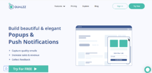
Email Popups are one of the most effective tools for building an email list. They attract website visitors’ attention and encourage them to enter their email addresses for more information or to take a desired action. Whether it’s to join your mailing list or sign up for a giveaway, it’s important to have an attractive design that gets the job done.
The best way to make an email popup stand out is to use striking colors and eye-catching images. These can be as simple or complex as you’d like, just make sure they are relevant to your offer. For example, this email popup from Restated Vintage uses a large, bold visual to grab attention. It also includes a compelling copy that tells visitors what they can expect from their purchase.
Another great design feature is using layered imagery. This helps to break up the text and create more space for the CTA. A clever and well-crafted popup can make a big impact on a visitor’s experience and their engagement with your business. It can also help you build a relationship with them so they will want to return for more and share their experiences with others.
In addition, a good email popup should align with your brand’s visual style and use short, compelling copy. This design from Gwen Beloti shows off some beautiful photography, a simple design and a smart color combination to catch the attention of visitors.
The copy is not as impressive as the design, however. The headline tries to capture the eye by highlighting a few important points and includes an intriguing line about a discount that will make you feel special. Lastly, the CTA is clever. This includes an appealing call-to-action button and a contrasting color that will attract attention. If you’re looking for some inspiration for your next email popup, check out these 8 cool and clever examples of email popup designs. They’ll help you generate ideas that match your brand and target audience.
Concise Copy
When writing copy for a website, landing page, or email campaign, it’s important to make sure that your message is concise and clear. Concise copy ensures that your readers understand your message without any struggle, which is essential for converting your visitors into paying clients and customers.
It is also important to write your copy so that it is readable by the average reader, whether it’s an 8th grader or a rocket scientist. This is why many companies use the Flesch Reading Ease Test to check if their copy is easily understandable.
You can also make it easier for your audience to follow your copy by using sentence fragments instead of full paragraphs. This will allow you to use less words and save on space, which can be crucial when working with small spaces and limited word count.
Your copy should be compelling and compel your target audience to take action. This can be done by evoking curiosity, unearthing pain points, and presenting a mutually valuable offer that’s tailored to your target market’s needs.
Incorporating an image into your text can help you create a stronger connection with your audience and captivate their attention. This is especially true of humanistic decision-makers, who are more likely to connect with brands that show emotion. The image here is a simple and attractive choice, which makes it easier for people to understand what the brand offers. It also helps them build a connection with the brand and encourages them to sign up for their newsletter.
This popup has two different call-to-action buttons that can be accessed with just a click of a button, which is another great way to get visitors to opt in. The first one is a “unlock now” button that allows visitors to get access to exclusive discounts and benefits. The second is a “join now” button that will give them a 10% discount on their first purchase.
When choosing an image for your email popup design, it is important to consider what will appeal to the majority of your visitors. This can include a well-known brand, an industry leader, or a trending topic. Alternatively, you can choose an image that speaks to your specific product or service. For example, a photo of a coffee cup is an effective tool for grabbing the attention of a consumer who is looking for premium coffee.
Optimized Timing
Email popups are one of the most effective ways to collect emails from your visitors. They help you build your mailing list and generate more leads. But it’s important to design them carefully and optimize them for timing.
There are several aspects to take into consideration when designing a popup: headline, offer, visuals and CTA button. Keeping all these in mind can help you create an attractive and effective popup that will convert your visitors into subscribers.
Headline
The headline of your email popup is the first thing that visitors will notice. The right headline will grab their attention and make them want to read more. It must be interesting and relevant to the message you want to convey in your email popup.
Offering
You can also offer a discount, incentive or information about how signing up for your newsletter can be beneficial to them. This can be done by including a relevant image or video in your email popup. Using an offer that is relevant to your business is a great way to increase the number of sign-ups you get from your email popup. For example, a small coffee shop may want to use an offer like “$15 off your first order” as a lure for new visitors to sign up.
Graphics
The design of your email popup should match the theme of your website. Choosing the right colors and fonts will keep your popup consistent with your brand.
Images
Having an image in your email popup that is relevant to the offer you are offering can increase the number of subscribers you receive. For instance, if you are running a contest, you can incorporate an image that is appropriate for the prize being awarded.
Text
Your copy should be short and to the point, making it easy for your visitors to learn about the offer. If you don’t do this, your popup will probably lose its effectiveness and won’t be able to convince the visitors to sign up. When it comes to designing an email popup, the best advice is to stay simple and not go overboard with colorful graphics. A simple popup can be just as effective as a colorful one and will still have a positive impact on your conversions.
Convenient CTA
A great email popup design communicates your brand identity and conveys your message in a way that’s appealing to visitors. It should also use colors, fonts, and layouts that reflect your company’s style and image.
Using a good CTA is essential to getting high conversions from your popups. It’s a way to encourage visitors to fill out your form and take the next step, whether it’s downloading a free ebook, signing up for your newsletter, or purchasing something from your website.
You can use the same CTA on your entire website to increase clicks and conversions. Alternatively, you can personalize the CTA for each visitor so that they see something that’s relevant to them. You can even add a timer to create a sense of urgency for your offer.
Another way to boost your CTA is by incorporating a lead magnet, or incentive. This can include a discount on your product or a free trial. This example from BlendJet combines an attractive product image with a tempting 15% off. The bold text and contrasting color make it easy to notice and engage with this lead magnet.
The email capture form on this popup is clean and simple, requiring only an email address to sign up. This is a very efficient strategy, since it’s a great incentive to sign up for your email list and offers a high level of convenience to visitors.
A great CTA doesn’t have to be complicated, but it does need to stand out from your other forms and content. For instance, a popup that offers a 10% off coupon should be one of the most prominent elements on your email popup, so that it’s immediately visible to visitors and draws their attention.
It’s also a good idea to use a different color on your CTA button to help it stand out from the rest of the text. Adding a contrasting color is an excellent idea, as it will increase clicks and boost conversion rates.
Another important factor is to choose the right image for your email popup. People are naturally drawn to images that show human emotion, especially those that show positive reactions to a product or service. A happy, cute image is a powerful way to grab the attention of your audience and increase engagement with your email popup.


Leave a Reply